Choosing a website color scheme is one of the most exciting stages of building a website. Colors have the power to set the underlying tone for emotions and associations. The right combination can increase engagement, while the wrong choices can drive visitors away.
This guide gives you a practical approach to building a website color scheme that fits your brand and keeps your visual appeal sharp.
The Importance of Choosing a Color Scheme
Studies show a strong correlation between color psychology and user behavior. Colors influence how visitors perceive your brand, how long they stay on your site, and whether they take action. Research indicates that 90% of snap judgments about products are based on color alone.
Understanding Color Psychology
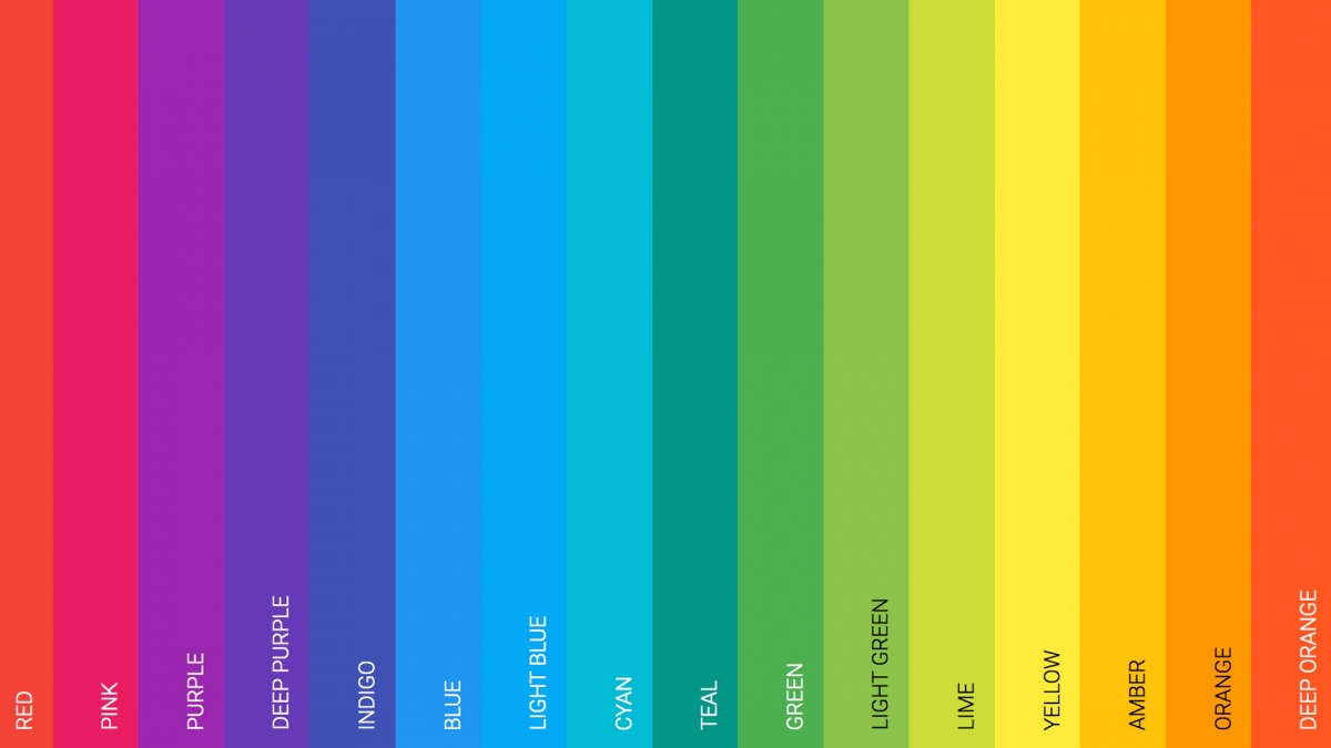
Blue: Trust, professionalism, security. Popular for banks, healthcare, and corporate sites.
Green: Nature, growth, health. Used by eco-friendly brands, wellness, and finance.
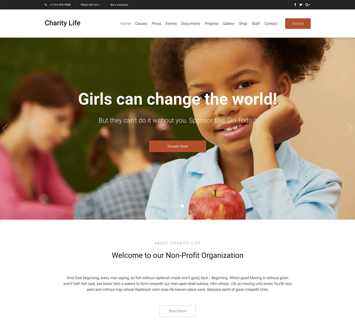
Red: Energy, urgency, passion. Effective for calls-to-action and sales.
Orange: Creativity, enthusiasm, affordability. Great for creative agencies and retail.
Yellow: Optimism, clarity, warmth. Works well for children’s brands and food.
Purple: Luxury, creativity, wisdom. Common in beauty and premium products.
Black: Sophistication, elegance, power. Used by luxury brands and minimalist designs.
Color Scheme Types
Monochromatic
Uses various shades and tints of a single color. Creates a cohesive, elegant look. Best for minimalist designs and portfolios.
Complementary
Uses colors opposite each other on the color wheel (like blue and orange). Creates high contrast and visual interest. Great for making elements stand out.
Analogous
Uses colors adjacent on the color wheel (like blue, blue-green, green). Creates harmonious, comfortable designs. Works well for nature and wellness sites.
Triadic
Uses three colors equally spaced on the color wheel. Creates vibrant, balanced designs. Popular for children’s brands and creative sites.
The 60-30-10 Rule
A classic design principle for color distribution:
- 60% Dominant Color: Your main color, typically for backgrounds
- 30% Secondary Color: Supports the primary, used for headers and sections
- 10% Accent Color: Creates visual interest, used for calls-to-action and highlights
Best Website Color Scheme Tools
Coolors
Generate, adjust, and save color palettes quickly. Press spacebar to explore endless combinations. Export palettes in multiple formats.
Try CoolorsAdobe Color
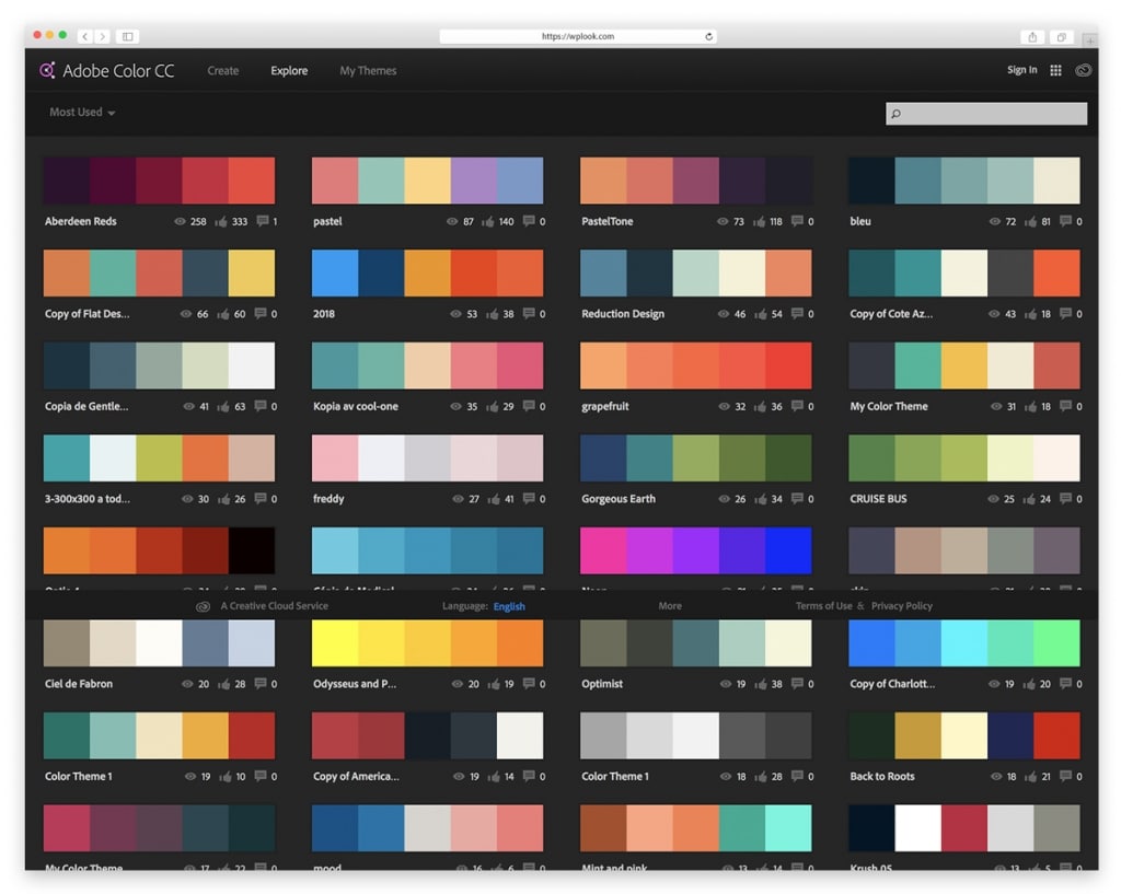
Create color schemes using the color wheel or extract palettes from images. Integrates with Adobe Creative Cloud applications.
Try Adobe ColorPaletton
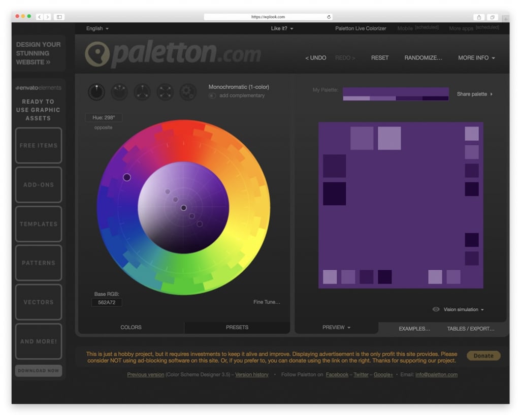
Advanced color scheme designer with presets for complementary, triadic, and tetradic schemes. Preview colors in sample layouts.
Try PalettonColor Hunt
Curated collection of beautiful color palettes. Browse trending, popular, and random palettes for instant inspiration.
Try Color HuntTips for Choosing Colors
- Start with your brand: Your logo colors should inform your website palette
- Consider your audience: Different demographics respond to colors differently
- Test for accessibility: Ensure sufficient contrast for readability
- Use white space: Don’t feel pressured to fill every space with color
- Test on different screens: Colors display differently across devices
Related Resources
- Social Media Color Palette – Brand colors for platforms
- Free Design Resources – Complete toolkit
- Web Designer Tools – Essential software
Frequently Asked Questions
- How many colors should a website have?Most websites work best with 3-5 colors: a dominant color, a secondary color, one or two accent colors, and neutral shades for text and backgrounds. More colors can work but require careful balance.
- Should I follow color trends?Trends can provide inspiration, but choose colors that align with your brand identity and will remain effective over time. Classic color combinations often outlast trendy palettes.
- How do I ensure color accessibility?Use tools like WebAIM’s Contrast Checker to verify your color combinations meet WCAG accessibility guidelines. Aim for a contrast ratio of at least 4.5:1 for normal text.
Elevate Your Online Presence with Our Free WordPress Themes
Craft Your Debut Blog or Nonprofit Website with Our Complimentary Themes!
Discover Free Themes