
Google serif fonts bring classic typography to your WordPress site—for free. The right serif font gives your WordPress theme authority, elegance, and readability that sans-serif fonts simply can’t match. Whether you’re building a blog, magazine theme, or business website on WordPress, these Google serif fonts deliver professional results with zero licensing costs.
We’ve tested and ranked the 10 best Google serif fonts for WordPress themes in 2026. Each font is free, web-optimized, and ready for your next WordPress project. Also check out the top sans-serif fonts for WordPress themes and our complete design resources guide. If you’re looking for a theme that supports custom Google Fonts, browse our WordPress themes collection.
What Are Google Serif Fonts?
Serif fonts have small decorative strokes (called serifs) at the ends of letterforms. These strokes guide the eye along lines of text, making serif fonts the traditional choice for long-form reading. Google Fonts offers hundreds of free serif typefaces that you can add to any WordPress theme through the Customizer, a plugin, or by self-hosting the font files.
The difference between serif and sans-serif fonts is simple: serifs have the decorative strokes, sans-serifs don’t. Most WordPress theme designers use serif fonts for body text and headings that need authority, while pairing them with sans-serif fonts for navigation, buttons, and UI elements.
Serif vs Sans-Serif: When to Use Each
Choose serif fonts when you want:
- Authority and trust – Law firm themes, financial services, news themes
- Long-form readability – WordPress blog posts, articles, magazine themes
- Elegance and luxury – Fashion themes, jewelry shops, high-end WooCommerce stores
- Traditional feel – Academic sites, literary blogs, publishing themes
Choose sans-serif fonts when you want:
- Modern, clean aesthetic – Tech themes, startup sites, SaaS landing pages
- UI and interface text – WordPress menus, buttons, widget areas
- Small text legibility – Captions, footnotes, mobile-responsive themes
- Minimalist design – Portfolio themes, one-page WordPress themes
The best WordPress themes combine both. Use a serif font for headings or body text and pair it with a complementary sans-serif for navigation and UI elements. Every font below includes our recommended pairings for WordPress themes.
Best Google Serif Fonts for WordPress Themes
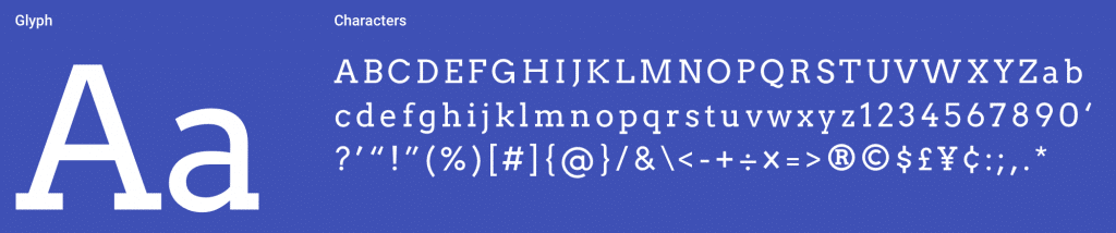
Playfair Display (Editor’s Choice)
Playfair Display is a transitional serif designed by Claus Eggers Sørensen. Featured on more than 3,700,000 websites, it’s one of the most popular Google serif fonts for WordPress theme headings and display text. The high contrast between thick and thin strokes gives it an elegant, editorial quality that works beautifully for magazine WordPress themes, luxury brand sites, and creative portfolio themes.
Key Features
- 3.7M+ websites use this font
- High contrast transitional design
- Ideal for headings and display text
- Pairs perfectly with Georgia for body text
- Regular, Bold, and Italic styles
- Free and open source
Best Pairings: Lato, Roboto, Raleway, Oswald, Open Sans Condensed
Best For: WordPress magazine themes, luxury branding sites, editorial layouts, and any WordPress theme that needs an elegant, high-contrast serif font for headings.
Merriweather
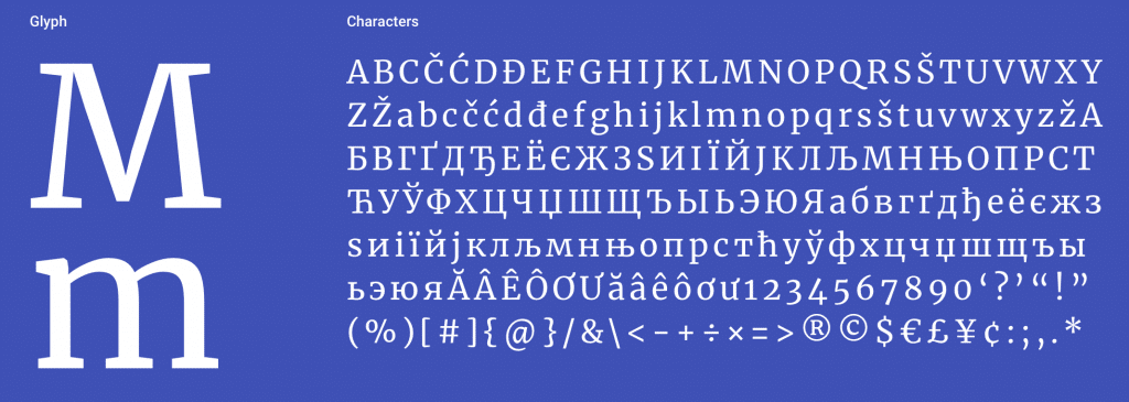
Merriweather, designed by Sorkin Type, was created specifically to be pleasant to read on screens—making it a natural fit for WordPress blog themes. It features a very large x-height, slightly condensed letterforms, mild diagonal stress, sturdy serifs, and open forms. Featured on more than 2,900,000 websites, it’s the go-to serif font for WordPress body text. Merriweather Sans provides a harmonizing sans-serif companion for your theme’s navigation and UI.
Key Features
- 2.9M+ websites use this font
- Designed specifically for screen readability
- Large x-height for legibility
- Merriweather Sans companion available
- Light, Regular, Bold, and Black weights
- Free and open source
Best Pairings: Open Sans, Oswald, Montserrat, Lato, Roboto
Best For: WordPress blog themes, news themes, and any WordPress site where long-form readability is the top priority.
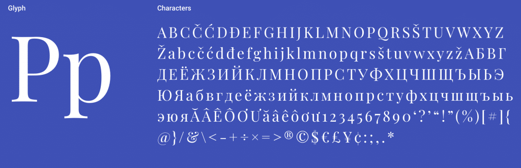
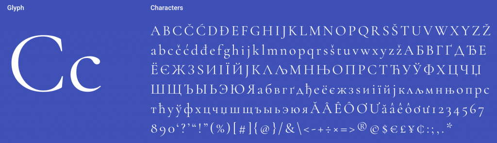
Libre Baskerville
Libre Baskerville by Impallari Type is optimized for body text at 16px—the default font size in most WordPress themes. Based on the American Type Founder’s Baskerville from 1941, it features a taller x-height, wider counters, and less contrast than traditional Baskerville for excellent screen reading. Featured on more than 3,000,000 websites, it brings classic book typography to WordPress.
Key Features
- 3M+ websites use this font
- Optimized for 16px body text
- Based on classic Baskerville design
- Taller x-height for screen reading
- Regular, Bold, and Italic styles
- Free and open source
Best Pairings: Poppins, Lato, Roboto, Oswald, Playfair Display
Best For: WordPress publishing themes, literary blogs, and professional content sites that need a classic, trustworthy serif with modern screen optimization.
Lora
Lora is a contemporary serif with calligraphic roots, designed by Cyreal. Technically optimized for screen display, it’s a popular choice for WordPress themes that need warmth and personality. The brushed curves give paragraphs an elegant appearance with moderate contrast appropriate for body text. Featured on more than 1,500,000 websites, Lora balances personality with readability in WordPress themes.
Key Features
- 1.5M+ websites use this font
- Calligraphic brush-stroke details
- Moderate contrast for body text
- Works in both screen and print
- Variable font support
- Free and open source
Best Pairings: Open Sans, Lato, Raleway, Montserrat, Roboto
Best For: WordPress blog themes, lifestyle themes, and WordPress designs that need a serif font with personality and warmth beyond standard options.
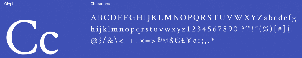
Cormorant Garamond
Cormorant Garamond by Christian Thalmann is a display type family with 45 font files spanning 9 visual styles and 5 weights. Featured on more than 2,000,000 websites, this modern interpretation of Claude Garamond’s designs brings Renaissance elegance to WordPress themes. The extensive style range (Roman, Italic, Infant, Small Caps, Unicase) gives WordPress theme designers exceptional flexibility for headings, body text, and decorative elements.
Key Features
- 2M+ websites use this font
- 45 font files across 9 styles
- 5 weights (Light to Bold)
- Small Caps and Unicase variants
- Renaissance-inspired elegance
- Free and open source
Best Pairings: Lato, Roboto, Playfair Display, Oswald, Raleway
Best For: Luxury WordPress themes, wedding sites, fashion blogs, and WooCommerce themes that need refined Renaissance elegance with modern web performance.
PT Serif
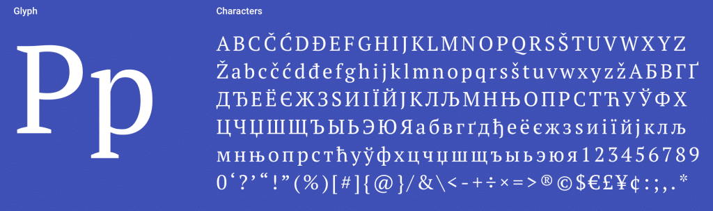
PT Serif by ParaType includes standard Western, Central European, and Cyrillic character sets. Designed to harmonize with PT Sans across metrics, proportions, and weights, it’s the best serif option for multilingual WordPress sites. The family includes six styles: regular and bold with italics, plus two caption styles. Featured on more than 1,000,000 websites, PT Serif is the top choice for WordPress themes serving international audiences.
Key Features
- 1M+ websites use this font
- Western, Central European, and Cyrillic support
- Harmonizes with PT Sans companion
- Six styles including caption variants
- Designed for multilingual content
- Free and open source
Best Pairings: Open Sans, PT Sans, Roboto, Source Sans Pro, Oswald
Best For: Multilingual WordPress themes, especially those serving Cyrillic-language audiences. The PT Sans pairing creates a cohesive multilingual type system for WordPress sites with WPML or Polylang.
Noto Serif
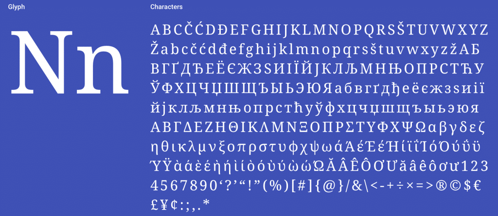
Noto Serif is Google’s ambitious project to create visually harmonious fonts across all languages—a perfect match for WordPress’s multilingual capabilities. Currently covering over 30 scripts, this serif family includes Latin, Greek, and Cyrillic with Regular, Bold, Italic, and Bold Italic styles. Featured on more than 550,000 websites. The “Noto” name comes from “no tofu”—eliminating the blank rectangles that appear when a WordPress theme doesn’t support a character.
Key Features
- 550K+ websites use this font
- Covers 30+ writing scripts
- Designed by Google
- Harmonizes across all languages
- Eliminates missing character “tofu”
- Free and open source
Best Pairings: Noto Sans, Inconsolata, Open Sans, Lato, Roboto
Best For: Global WordPress sites serving content in multiple scripts and languages. The universal coverage eliminates missing character issues across all WordPress theme templates.
Bitter
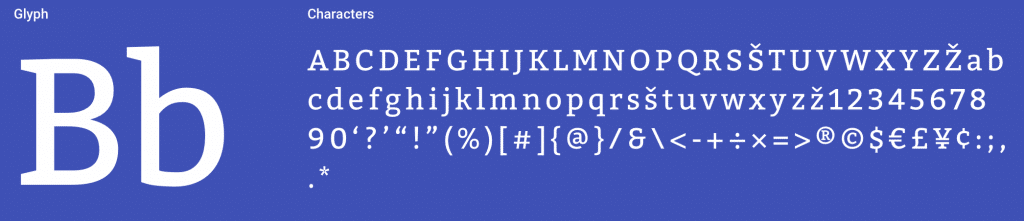
Bitter by Sol Matas Huerta (Huerta Tipográfica, Argentina) was designed specifically for comfortable screen reading—exactly what WordPress blog themes need. The Regular weight is thicker than typical print designs, creating intense color in paragraphs accentuated by thick serifs with square terminals. Featured on more than 710,000 websites, Bitter brings a warm, approachable feel to WordPress content.
Key Features
- 710K+ websites use this font
- Designed for screen reading comfort
- Thick serifs with square terminals
- Warm, approachable paragraph color
- Light through Bold weights
- Free and open source
Best Pairings: Open Sans, Source Sans Pro, Roboto, Lato, Oswald
Best For: Content-heavy WordPress themes that need a warm, approachable serif with strong screen readability and distinctive character for blog posts.
Arvo
Arvo by Anton Koovit is a geometric slab-serif suitable for both screen and print. The name means “number, value, worth” in Finnish. The nearly monolinear stroke weight increases legibility, while the geometric construction gives it a modern, structured feel that works well in WordPress theme headings and widget titles. Featured on more than 700,000 websites, Arvo is particularly popular for WordPress themes targeting tech and startup audiences.
Key Features
- 700K+ websites use this font
- Geometric slab-serif design
- Nearly monolinear for high legibility
- Works for screen and print
- Regular, Bold, and Italic styles
- Free and open source
Best Pairings: Open Sans, Lato, Roboto, Oswald, Raleway
Best For: Tech startup WordPress themes, SaaS landing pages, and modern WordPress designs that need a structured slab-serif with high legibility at any size.
Crimson Text
Crimson Text by Sebastian Kosch was created specifically for book production in the tradition of beautiful old-style typefaces. Featured on more than 450,000 websites, it brings the refined elegance of printed books to WordPress themes. The old-style numerals and ligatures add typographic sophistication that most WordPress fonts lack, making it a standout for literary and academic WordPress sites.
Key Features
- 450K+ websites use this font
- Created for book production
- Old-style numerals and ligatures
- Traditional old-style serif design
- Regular, Bold, and Italic styles
- Free and open source
Best Pairings: Open Sans, Lato, Raleway, Roboto, Lora
Best For: Literary WordPress themes, book blogs, academic publishing sites, and WordPress designs that want traditional typographic elegance with old-style details.
How to Add Google Serif Fonts to WordPress
Adding Google serif fonts to your WordPress site takes just a few steps:
1. Through Your Theme Settings
Most modern WordPress themes include Google Fonts integration. Check your theme’s Customizer settings (Appearance → Customize) for typography options. WPlook WordPress themes include Google Fonts with easy selection through the Customizer.
2. With a Plugin
Plugins like Easy Google Fonts or Fonts Plugin let you add any Google Font without editing code. Install the plugin, select your fonts, and assign them to headings, body text, or specific CSS selectors.
3. Self-Hosting for Performance
For the best performance and GDPR compliance, self-host Google Fonts. Download the font files from fonts.google.com, upload them to your server, and reference them in your CSS with @font-face declarations. This eliminates external requests and keeps font loading under your control.
Google Serif Font Pairing Tips
Great font pairings create visual hierarchy and contrast in WordPress themes. Here are proven principles for pairing Google serif fonts in your WordPress site:
- Contrast is key – Pair a serif heading font with a sans-serif body font (or vice versa)
- Match the mood – Pair elegant serifs (Playfair Display) with refined sans-serifs (Lato), not casual ones
- Limit to 2-3 fonts – More fonts slow your WordPress site and create visual clutter
- Use weight for hierarchy – Bold headings, regular body text, light captions
- Test at real sizes – A font that looks great at 48px may struggle at 16px
Our favorite combinations:
- Playfair Display + Lato (editorial elegance)
- Merriweather + Open Sans (readable and balanced)
- Cormorant Garamond + Montserrat (luxury and modern)
- Libre Baskerville + Poppins (classic meets contemporary)
- Lora + Roboto (warm and clean)
Related Font Collections
- Top Sans-Serif Fonts for WordPress Themes – Clean, modern typefaces for WordPress
- Handwritten Fonts – Personal, artistic typefaces for WordPress
- Design Resources Guide – Complete toolkit for WordPress designers
- Browse WordPress Themes – Premium themes with Google Fonts support
Frequently Asked Questions
- What is the best Google serif font for WordPress body text?Merriweather is the best Google serif font for WordPress body text. It was designed specifically for screen readability with a large x-height and open letterforms—ideal for long WordPress blog posts. Libre Baskerville is a close second, optimized for 16px body text which is the default size in most WordPress themes.
- What is the best Google serif font for WordPress theme headings?Playfair Display is the best Google serif font for WordPress theme headings. Its high contrast and transitional design create striking, elegant headlines in any WordPress theme. For a more classic look, try Cormorant Garamond which offers 45 font files across 9 styles.
- Are Google Fonts free to use in WordPress themes?Yes, all Google Fonts are free for personal and commercial use in WordPress themes. They are released under open source licenses (mostly SIL Open Font License). You can use them in your WordPress site, WooCommerce store, in print materials, and in products without any fees or attribution requirements.
- How do I add Google serif fonts to my WordPress theme?The easiest way is through your WordPress theme’s Customizer typography settings—most modern themes like WPlook themes include built-in Google Fonts integration. Alternatively, use a plugin like Easy Google Fonts or Fonts Plugin. For the best performance and GDPR compliance, self-host the font files and load them with @font-face in your child theme’s CSS.
- What is the difference between serif and sans-serif fonts in WordPress?Serif fonts have small decorative strokes at the ends of letters (like Times New Roman). Sans-serif fonts lack these strokes (like Arial). In WordPress themes, serifs are traditional and elegant—ideal for blog post body text and headings. Sans-serifs are clean and modern, popular for WordPress navigation, buttons, and UI elements. The best WordPress themes combine both for visual hierarchy.
No doubt, that Serif fonts have the most elegant and classic font appearance. In love with the Libre Baskerville font. It has the most elegant font appearance that makes the designs look more attractive and professional. Looking to utilize this typeface in my upcoming designs. Thanks keep up the good work.