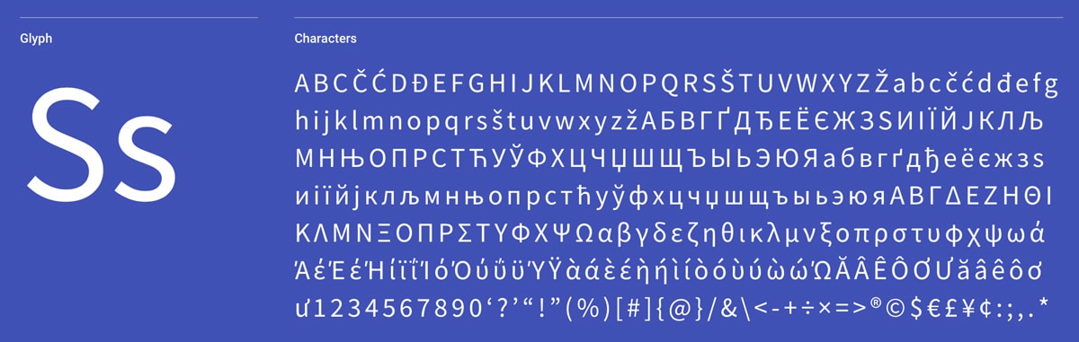
Choosing the right sans-serif Google fonts for your WordPress theme is one of the most impactful design decisions you will make. Sans-serif fonts do not have the extending features called “serifs” at the end of strokes, giving them a clean, modern look that works beautifully on screens of all sizes. They tend to have less line width variation than serif fonts and are the dominant choice for WordPress themes that need to convey simplicity, modernity, or minimalism.
Most WordPress themes include built-in typography settings through the Customizer, making it easy to switch between Google Fonts without touching code. Whether you are building a WordPress website for a business, nonprofit, or personal blog, the sans-serif font you choose will shape how visitors perceive your brand and how comfortably they read your content. Here are the 10 best sans-serif Google Fonts for WordPress themes in 2026, with guidance on where each one shines. Also explore the best serif fonts for WordPress if you need a more traditional feel.
Sans-Serif Google Fonts Compared at a Glance
| Font | Designer | Style | Best Use | Pairs Well With |
|---|---|---|---|---|
| Roboto | Christian Robertson | Neo-grotesque, neutral | Body and UI text | Roboto Slab, Roboto Mono |
| Open Sans | Steve Matteson | Humanist, friendly | Body and headings | Merriweather, Lora |
| Montserrat | Julieta Ulanovsky | Geometric, bold | Headlines and posters | Open Sans, Roboto |
| Lato | Lukasz Dziedzic | Semi-rounded, warm | Body and corporate | Merriweather, Source Sans |
| Raleway | McInerney, Impallari | Elegant thin display | Hero text and titles | Open Sans, Lato |
| Oswald | Vernon Adams | Condensed gothic | Tight headers, sidebars | Open Sans, PT Sans |
| Noto Sans | Google and Monotype | Universal multilingual | International sites | Noto Serif, Roboto |
| Source Sans Pro | Paul D. Hunt, Adobe | Clean grotesque | Long-form reading | Source Serif, Lora |
| Roboto Condensed | Christian Robertson | Condensed neo-grotesque | Data tables, navs | Roboto, Roboto Slab |
| Mina | TypeTogether | Indic and Latin display | Bilingual headlines | Lora, Merriweather |
Roboto
Roboto is designed by Christian Robertson and used by over 20 million websites, making it the most popular sans-serif font for WordPress themes and web projects. It has a dual nature with a mechanical skeleton and largely geometric forms, while featuring friendly and open curves that create a natural reading rhythm. For WordPress themes, Roboto works equally well as body text and headings, especially on business, technology, and WooCommerce themes where clarity matters most.
Key Features
- 12 styles from Thin to Black with matching italics
- Excellent screen legibility at all sizes
- Default font for Android and Material Design
- Supports Latin, Cyrillic, and Greek scripts
- Optimized for digital screens
- Pairs well with serif fonts like Playfair Display
Popular Pairings: Open Sans, Lato, Raleway, Oswald, Playfair Display
Best For: WordPress business themes, WooCommerce stores, portfolio themes, and any WordPress site that needs a versatile, highly readable sans-serif font with extensive weight options.
Open Sans
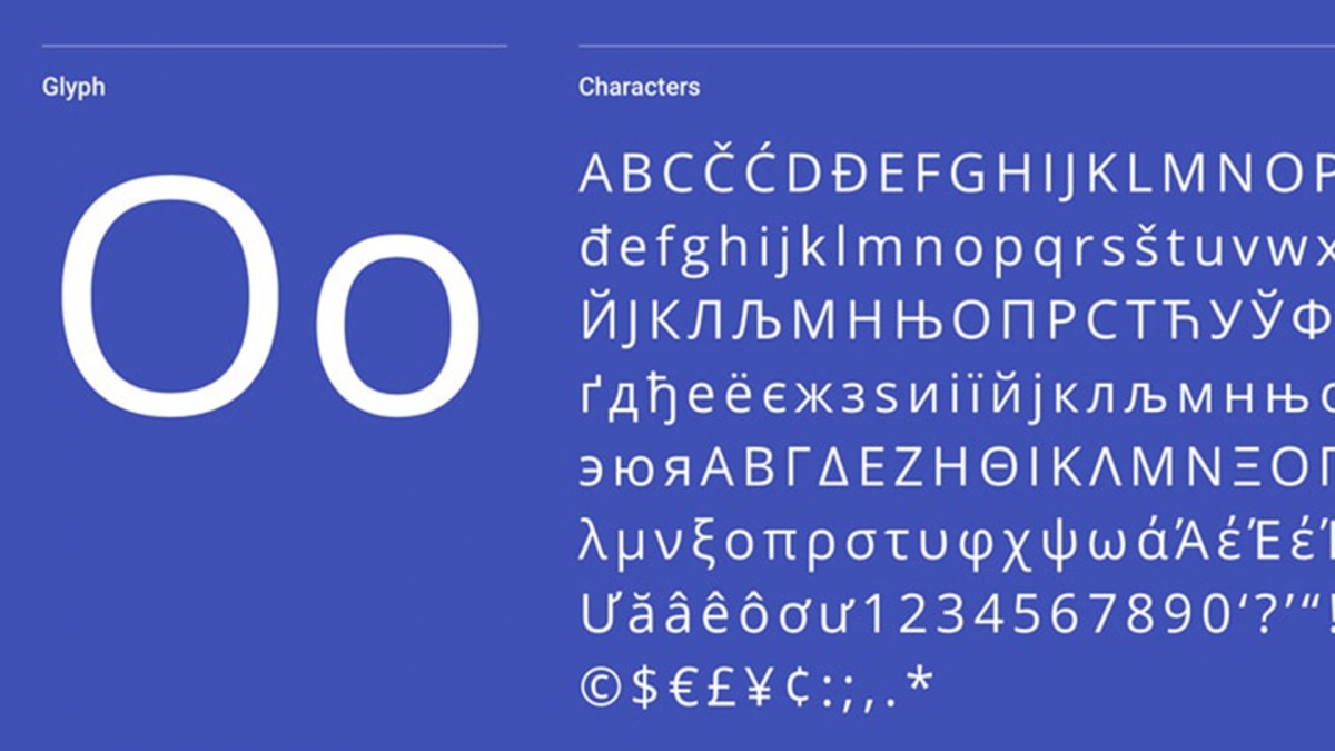
Open Sans is designed by Steve Matteson, Type Director of Ascender Corp, and used by over 21 million websites. Open Sans was the default WordPress admin font for years, making it instantly familiar to WordPress users and visitors alike. This humanist sans-serif typeface contains the complete 897 character set, including Latin, Greek, and Cyrillic — ideal for multilingual WordPress sites. Its upright stress, open forms, and neutral yet friendly appearance are optimized for print, web, and mobile interfaces.
Key Features
- 897 character set with broad language support
- 10 weights from Light to Extra Bold
- Humanist design with excellent readability
- Optimized for print, web, and mobile
- Standard ISO Latin 1, Latin CE, Greek, and Cyrillic
- Neutral appearance suitable for any industry
Popular Pairings: Lato, Oswald, Roboto, Raleway, Montserrat
Best For: WordPress blog themes, nonprofit sites, magazine themes, and any WordPress theme needing excellent multilingual support. Its neutral, friendly character makes it work across industries from healthcare to technology.
Montserrat
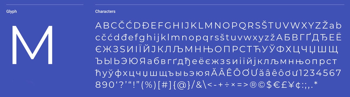
Montserrat is designed by Julieta Ulanovsky and used by over 5 million websites. Inspired by the old posters and signs in the traditional Montserrat neighborhood of Buenos Aires, this geometric sans-serif rescues the beauty of urban typography from the first half of the twentieth century. Montserrat is particularly popular in creative agency WordPress themes and portfolio themes where strong visual impact in headings and hero sections matters.
Key Features
- 18 styles from Thin to Black with italics
- Geometric design with vintage character
- Excellent for headings and display text
- Variable font version available
- Strong visual hierarchy at any weight
- SIL Open Font License
Popular Pairings: Open Sans, Roboto, Raleway, Lato, Oswald
Best For: WordPress theme headings, hero sections, and branding where you want a geometric sans-serif with more personality than Roboto or Open Sans. Ideal for creative agency, portfolio, and architecture themes.
Lato
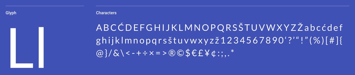
Lato is designed by Łukasz Dziedzic (“Lato” means “Summer” in Polish) and used by 11 million websites. The semi-rounded details give Lato a feeling of warmth, while the strong structure provides solidity and seriousness, creating a unique balance between friendly and professional.
Key Features
- 10 weights from Hairline to Black
- Warm, semi-rounded letterforms
- Strong structure with friendly character
- Published under Open Font License
- Excellent for both headings and body text
- Used by 11 million websites worldwide
Popular Pairings: Roboto, Open Sans, Oswald, Raleway, Playfair Display
Best For: WordPress themes that need warmth and approachability without sacrificing professionalism. Lato works beautifully for nonprofit themes, personal blog themes, church themes, and lifestyle WordPress themes.
Raleway
Raleway is an elegant sans-serif typeface originally designed by Matt McInerney as a single thin weight, later expanded into a 9 weight family by Pablo Impallari and Rodrigo Fuenzalida. Used by over 7.1 million websites, it has become a staple for designers seeking elegance in a sans-serif font.
Key Features
- 9 weights from Thin to Black
- Elegant, sophisticated letterforms
- Distinctive thin weight for display use
- iKerned by Igino Marini for precise spacing
- Works well at large sizes for headings
- Over 7.1 million websites use this font
Popular Pairings: Roboto, Lato, Oswald, Playfair Display, Open Sans
Best For: Fashion, luxury, and creative WordPress themes where elegance matters. Raleway’s thin weights are particularly stunning for large headings and hero text in photography and wedding themes.
Oswald
Oswald is designed by Vernon Adams and used by 7.2 million websites. This condensed sans-serif adjusts the classic style of ‘Alternate Gothic’ typefaces with characters re-drawn and reformed to fit the pixel grid of standard digital screens. Oswald is a favorite for conference WordPress themes and event landing pages where you need bold, attention-grabbing headlines without taking up too much horizontal space.
Key Features
- 6 weights from Extra Light to Bold
- Condensed design saves horizontal space
- Re-drawn for optimal screen rendering
- Strong impact for headlines and navigation
- Modern take on classic gothic typefaces
- Variable font version available
Popular Pairings: Lato, Roboto, Open Sans, Raleway, Open Sans Condensed
Best For: WordPress magazine themes, news themes, conference sites, and fitness themes. Oswald commands attention in headlines and navigation menus without taking up too much room.
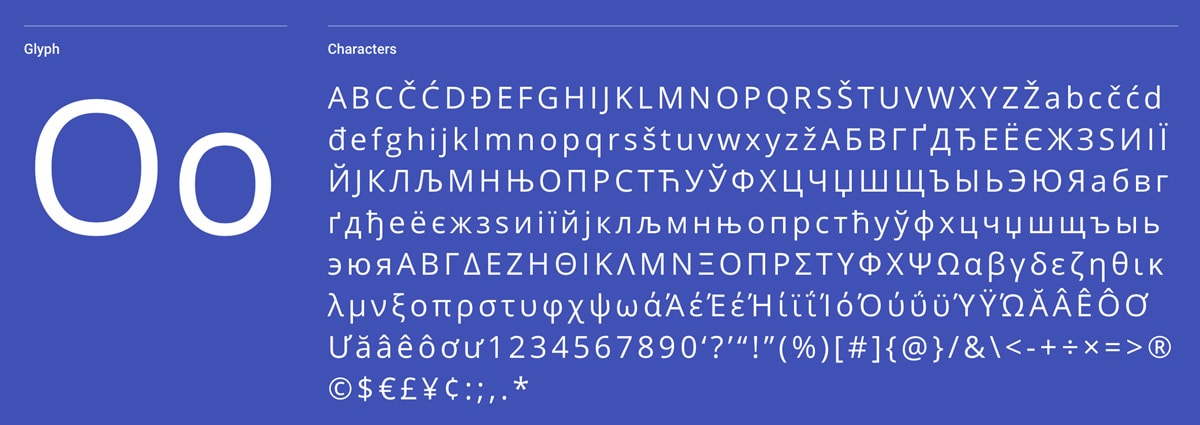
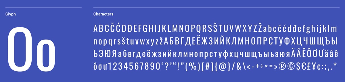
Noto Sans
Noto Sans is designed by Google as part of the Noto font project, covering more than 30 scripts to make the web more beautiful across all languages. Used by over 1 million websites, it aims to eliminate the “tofu” (blank rectangles) that appear when a font lacks a particular character.
Key Features
- Covers 30+ scripts and writing systems
- Regular, Bold, Italic, and Bold Italic styles
- Eliminates missing character issues
- Derived from Droid with improvements
- Pairs naturally with Noto Serif
- Backed and maintained by Google
Popular Pairings: Noto Serif, Open Sans, Inconsolata, Roboto, Source Sans Pro
Best For: Multilingual WordPress sites using WPML or Polylang, international nonprofit themes, and global business themes that need consistent typography across multiple languages and writing systems.
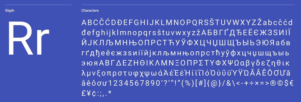
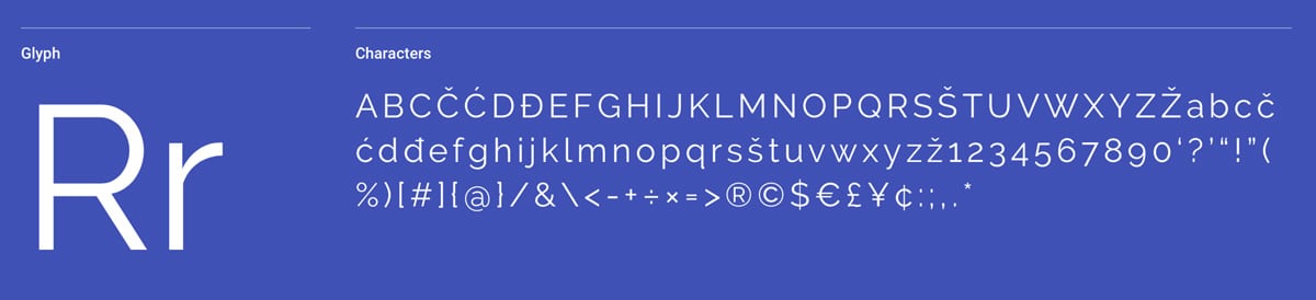
Source Sans Pro
Source Sans Pro is Adobe’s first open-source typeface family, designed by Paul D. Hunt specifically for user interfaces. Used by over 4.2 million websites, it brings the typographic quality of Adobe’s commercial fonts to the open-source world.
Key Features
- 12 styles from Extra Light to Black
- Designed specifically for UI readability
- Adobe’s first open-source typeface
- Pairs with Source Serif Pro and Source Code Pro
- Extensive language support
- Used by 4.2 million websites
Popular Pairings: Open Sans, Lato, Roboto, Oswald, Source Serif Pro
Best For: WordPress directory themes, membership sites, dashboard-style themes, and documentation sites where clarity and readability at small sizes in sidebars and footers are essential.
Roboto Condensed
Roboto Condensed shares the same dual nature as Roboto with a mechanical skeleton and largely geometric forms, but in a narrower proportion. Used by over 2.3 million websites, it provides the familiarity and readability of Roboto while fitting more text into tight spaces.
Key Features
- 6 styles from Light to Bold with italics
- Condensed width saves horizontal space
- Same quality and readability as Roboto
- Natural reading rhythm in narrow columns
- Works well for navigation and sidebars
- Over 2.3 million websites use this font
Popular Pairings: Roboto, Open Sans, Lato, Oswald, Raleway
Best For: WordPress theme navigation menus, sidebars, and data-heavy layouts like WooCommerce product grids where you need Roboto’s readability in a more compact form.
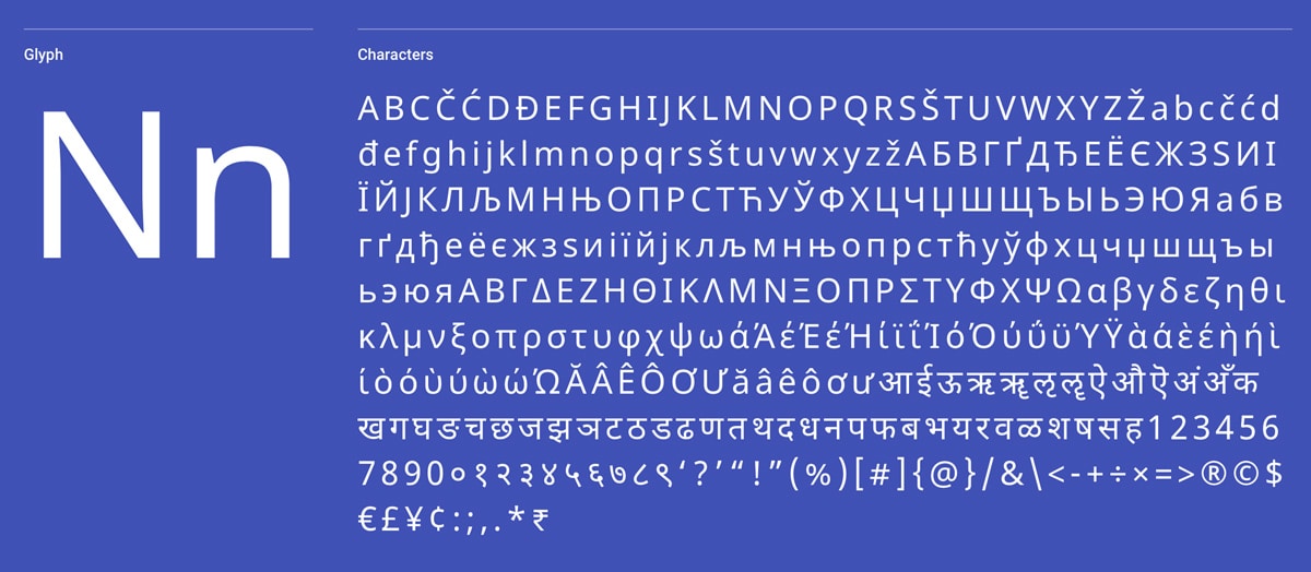
Mina
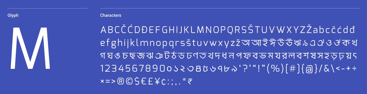
Mina is designed by Suman Bhandary and Natanael Gama as a contemporary geometric Bangla (Bengali) and Latin family. Extending from the Latin font Exo, it comes in two weights and bridges South Asian and Western typography in a single, cohesive typeface.
Key Features
- Regular and Bold weights available
- Bangla (Bengali) and Latin script support
- Contemporary geometric design
- Based on the popular Exo typeface
- Works well at small to intermediate sizes
- Suitable for both display and text use
Popular Pairings: Roboto, Open Sans, Montserrat, Lato, Raleway
Best For: Bilingual WordPress sites serving Bengali and English-speaking audiences that need a consistent, geometric typeface across both scripts. A strong option for South Asian community and nonprofit WordPress themes.
More Sans-Serif Google Fonts and Resources
- Best Google Serif Fonts for WordPress – Classic, elegant typefaces for body text and headings
- Handwritten Fonts for Designers – Personal, artistic typefaces for creative WordPress themes
- Design Resources Guide – Complete toolkit for WordPress designers
- Best Free WordPress Themes – Themes with great built-in typography options
Frequently Asked Questions
- What is the best sans-serif font for WordPress themes?Roboto and Open Sans are the most popular sans-serif fonts for WordPress themes because they are highly readable, support multiple languages, and look great at any size. For headings specifically, Poppins and Montserrat are excellent choices that pair well with serif body fonts.
- How do I add Google Fonts to my WordPress theme?Most WordPress themes include a typography option in the Customizer (Appearance → Customize). You can also use a plugin like Fonts Plugin to add any Google Font to any theme. For the best performance, self-host the font files in your theme instead of loading them from Google’s servers.
- Should I self-host Google Fonts on my WordPress site?Yes. Self-hosting Google Fonts improves your WordPress site speed by removing the external request to fonts.googleapis.com. It also helps with GDPR compliance since you are not sending visitor data to Google. Most modern WordPress themes and font plugins support local font hosting.
- How many fonts should I use on my WordPress site?Stick to 2 font families maximum — one for headings and one for body text. Each additional font increases page load time and can hurt your Core Web Vitals scores. A common WordPress theme combination is a geometric sans-serif for headings (like Poppins or Montserrat) paired with a readable sans-serif or serif for body text.
Need Fast, Reliable WordPress Hosting?
Managed hosting with free SSL, daily backups and theme setup included.