Google Fonts make it easier for everybody to utilize web text fonts, including professional developers and designers. Typography is a key segment of website design, and the decision of which font to use can have a huge impact on how well they’re received. Bellow, you will find a list of the best Google Serif Fonts used in 2022 that you should check out. Also, you can find out which are the top 10 Sans-Serif Fonts used by Web Designers in 2022.
Merriweather
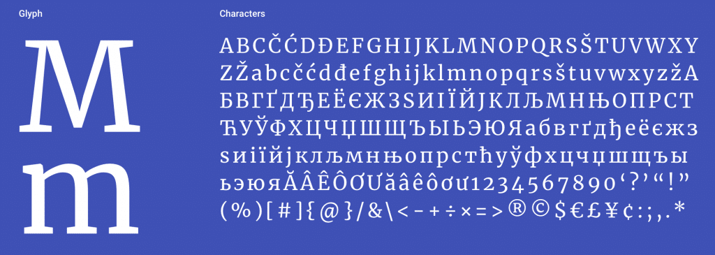
Merriweather, designed by Sorkin Type, was created to be a text face that is nice to read on screens. It includes very large x-height, slightly condensed letterforms, mild diagonal stress, sturdy serifs, and open forms. Merriweather Sans is a sans-serif version that closely harmonizes with the weights and styles of this serif family. Merriweather Serif Font is featured in more than 2,900,000 websites, and Google API displayed the font over 1.54B times in the last week.
Popular Pairings with Merriweather:
- Open Sans
- Oswald
- Montserrat
- Lato
- Roboto
Playfair Display

Playfair Display is designed by Claus Eggers Sørensen, a type designer based in Amsterdam, Netherland. Playfair is a transitional design and is featured on more than 3,700,000 websites. Being a Display (large size) design in the transitional genre, functionally and stylistically, it can accompany Georgia for body text. It was updated in November 2017 with many small improvements and additional language support.
Popular Pairings with Playfair Display:
- Lato
- Roboto
-
Raleway - Oswald
- Open Sans Condensed
Lora
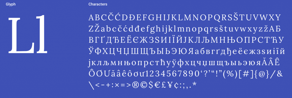
Lora is an adjusted contemporary serif with roots in calligraphy designed by Cyreal. Technically, Lora Serif Font is optimized for screen appearance and works similarly well in print. Lora is a text typeface with moderate contrast appropriate for body text. A paragraph set in Lora will make a great appearance because of its brushed curves compared to driving serifs. The general typographic voice of Lora perfectly conveys the mood of a modern-day story or an art essay. Lora is very popular, being featured on more than 1,500,000 websites.
Popular Pairings with Lora:
- Open Sans
- Lato
-
Raleway - Montserrat
- Roboto
PT Serif

The principal designer of PT Serif is ParaType, which was established in 1998 as a successor to the ParaGraph International type department. The fonts include standard Western, Central European, and Cyrillic code pages, plus the characters of every title language in the Russian Federation. It is designed for use with PT Sans and harmonized across metrics, proportions, weights, and design. The family consists of six styles: regular and bold weights with corresponding italics form a standard font family for basic text setting; two caption styles in regular and italic are used in small point sizes. PT Serif is featured on more than 1,000,000 websites and has its well-deserved place in the Best Google Serif Fonts.
Popular Pairings with PT Serif:
- Open Sans
- PT Sans
- Roboto
- Source Sans Pro
- Oswald
Noto Serif
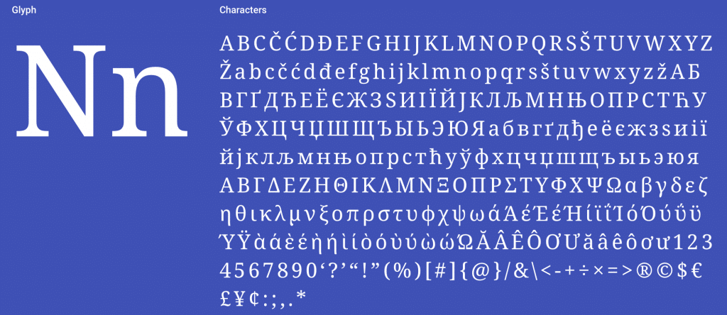
Featured in more than 550,000 websites and designed by Google, Noto Serif Noto helps to make the web more beautiful across platforms for all languages. Presently, Noto covers over 30 scripts and will cover all of Unicode in the future. This is the Serif Latin, Greek, and Cyrillic family. It has Regular, Bold, Italic, and Bold Italic styles and is hinted at. Noto fonts are intended to be visually harmonious across multiple languages, with compatible heights and stroke thicknesses.
Popular Pairings with Noto Serif:
- Noto Sans
- Inconsolata
- Open Sans
- Lato
- Roboto
Bitter

Sol Matas Huerta designs bitter for Huerta Tipográfica from Argentina. This font is specially designed to easily and pleasantly read on any computer or device. Bitter has little variation in stroke weight, and the Regular is thicker than a normal ‘Regular’ style for print design. This generates an intense color in paragraphs, accentuated by the serifs that are as thick as strokes with square terminals. Each glyph is carefully designed with an excellent curve quality added to the first stage of the design, entirely made in a pixel grid.
The typeface is balanced and manually spaced to use very few kerning pairs, especially for web font use since most browsers do not currently support this feature. Bitter is featured in more than 710,000 websites, and Google API displayed the font over 309M times in the last week.
Popular Pairings with Bitter:
- Open Sans
- Source Sans Pro
- Roboto
- Lato
- Oswaldo
Arvo

The principal designer of Arvo is Anton Koovit. In the Finnish language, Arvo means “number, value, worth.” Considering how much programming was engaged with implying it, that meanings are also significant. Arvo is a geometric slab-serif typeface family suitable for screen and print. This kind of textual style of the font is rather mixed, being nearly monolinear to expand legibility. Arvo is featured on more than 700,000 websites, and this kind of Serif is the most popular in the USA.
Popular pairings with Arvo:
- Open Sans
- Lato
- Roboto
- Oswald
-
Raleway
Crimson Text

Crimson Text is a popular font designed by Sebastian Kosch. This font family is specially created for book production in the tradition of beautiful old-style typefaces. Crimson Text is featured on more than 450,000 websites and is very popular in the USA.
Popular Pairings with Crimson Text:
- Open Sans
- Lato
-
Raleway - Roboto
- Lora
Libre Baskerville

Impallari Type has designed Libre Baskerville. Libre Baskerville is a web font optimized for body text (typically 16px.) It is based on the American Type Founder’s Baskerville from 1941, yet it has a taller x-height, wider counters, and somewhat less contrast that enable it to function great for reading on-screen.
Libre Baskerville is featured in more than 3,000,000 websites, and Google API displayed the font over 263M times in the last week, and Google API displayed the font over 263M times in the last week.
Popular pairings with Libre Baskerville:
- Poppins
- Lato
- Roboto
- Oswald
- Playfair Display
Cormorant Garamond

Christian Thalmann is the name of the person who developed this free display type family. This kind of Serif is featured on more than 2,000,000 websites, and it is the most popular in the USA. The project currently contains 45 font files spanning 9 distinctive visual styles (Roman, Italic, Infant, Infant Italic, Garamond, Garamond Italic, Upright Cursive, Small Caps, and Unicase) and 5 weights (Light, Regular, Medium, SemiBold, and Bold).
Popular pairings with Libre Baskerville:
- Lato, Roboto
- Playfair Display
- Oswald
-
Raleway
No doubt, that Serif fonts have the most elegant and classic font appearance. In love with the Libre Baskerville font. It has the most elegant font appearance that makes the designs look more attractive and professional. Looking to utilize this typeface in my upcoming designs. Thanks keep up the good work.